The Good Rhythm Zine
Where it all began
The Good Rhythm began in a typography classroom. For a project that required the creation of a zine with a topic of choice — The Good Rhythm came to life. With the TGR mission in mind, The Good Rhythm Zine combines visual and textual content in a way that is both functional and artistic to promote positivity through content and artistic expression. Implementing style elements that are inspired by the musical staff, the TGR zine has brought forward a musical platform that has evolved into this site. Outside of promoting the TGR mission, our zine also represents the versatility of music
Zine Design
How the music staff inspired the TGR style
Illustrations
The TGR zine’s illustrations are all hand drawn, utilizing a calligraphic style to represent both music’s expressive freedom, as well as the varying line weight of Roman serifed fonts that are used in sheet music. The flowing lines guide the reader through the pages, representing the journey that listening to music can take us.
Layout
The TGR zine’s layout reflects the structured science of music theory as well as drawing from visual components of the musical staff. Utilizing a black and white color scheme and a serifed title font, the zine takes inspiration from sheet music. The use of sans serif font and straight-forward layout of body text represents music’s structure and theory.
Zine Preview
Take a look at the preview below!
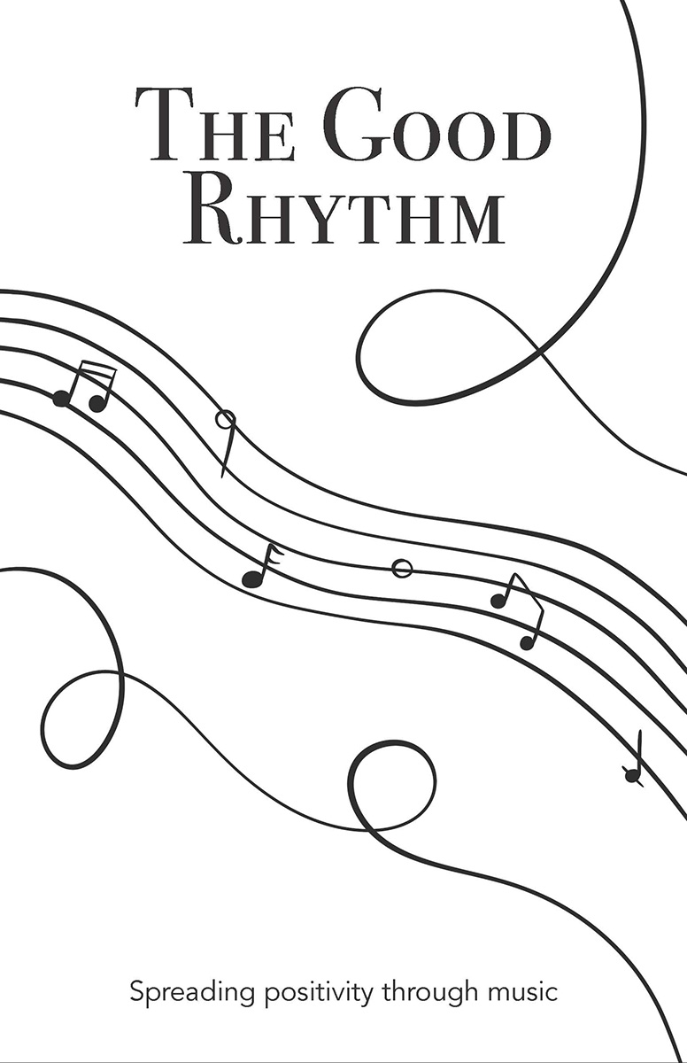

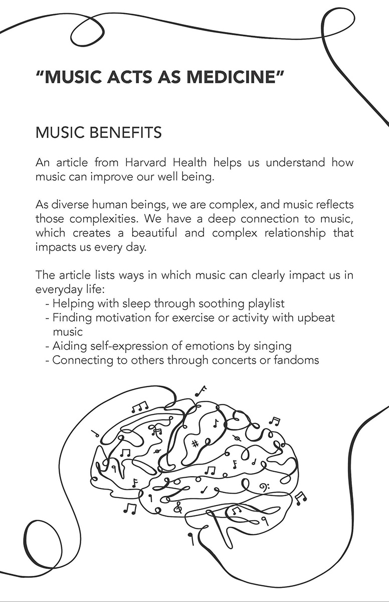
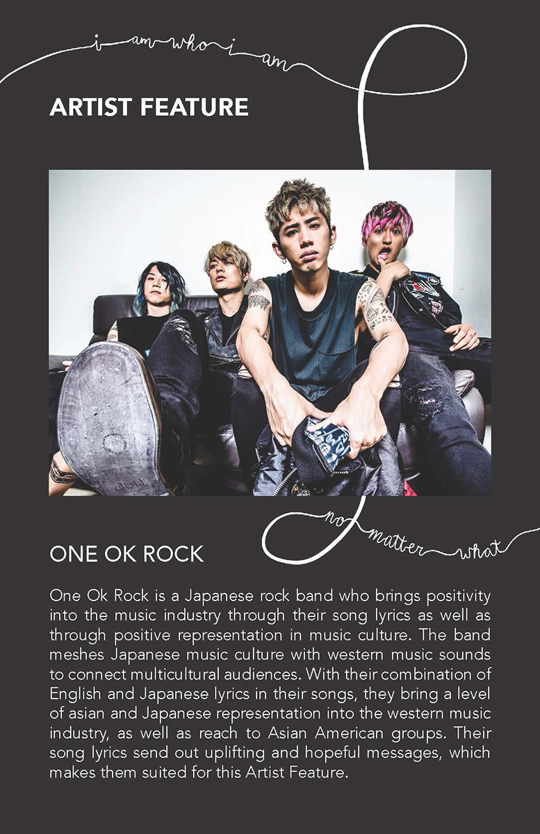
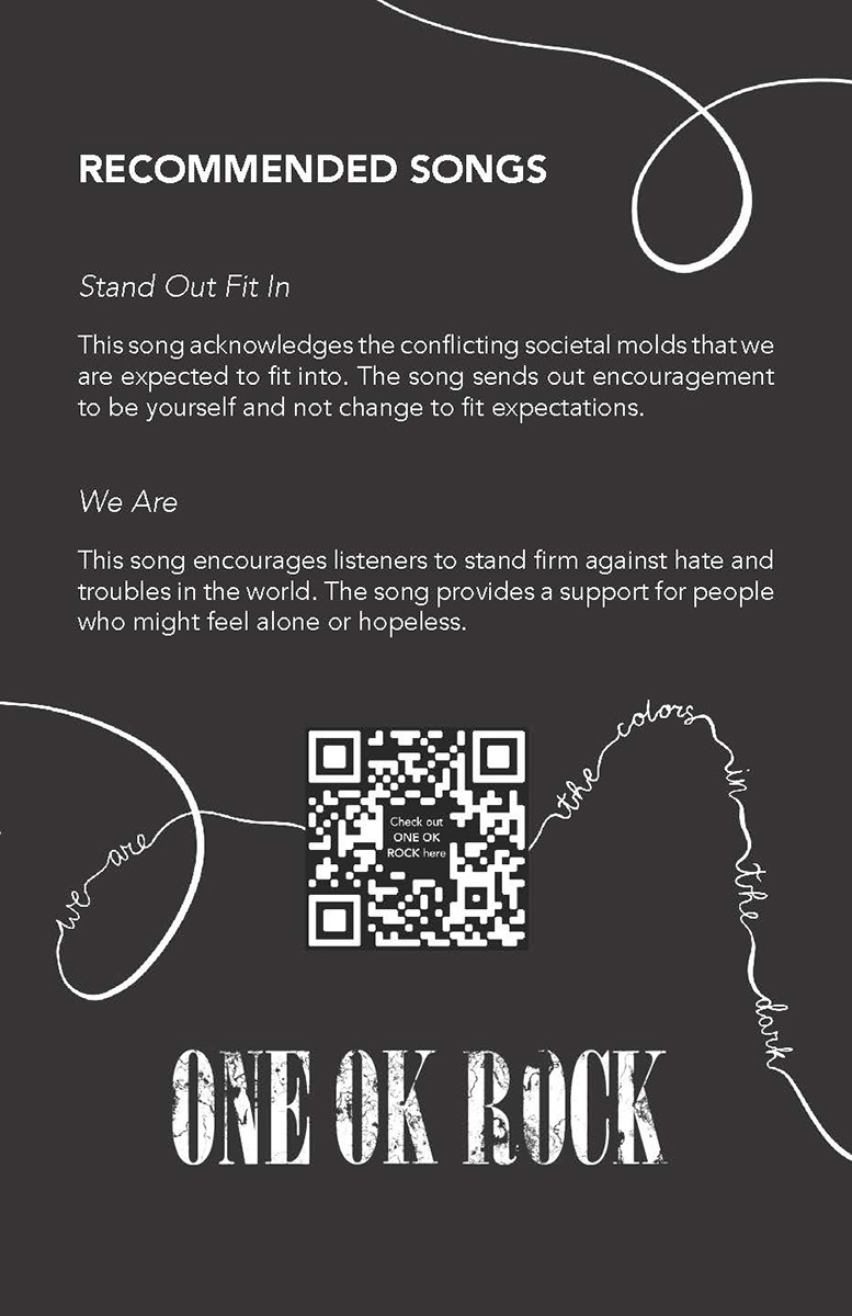
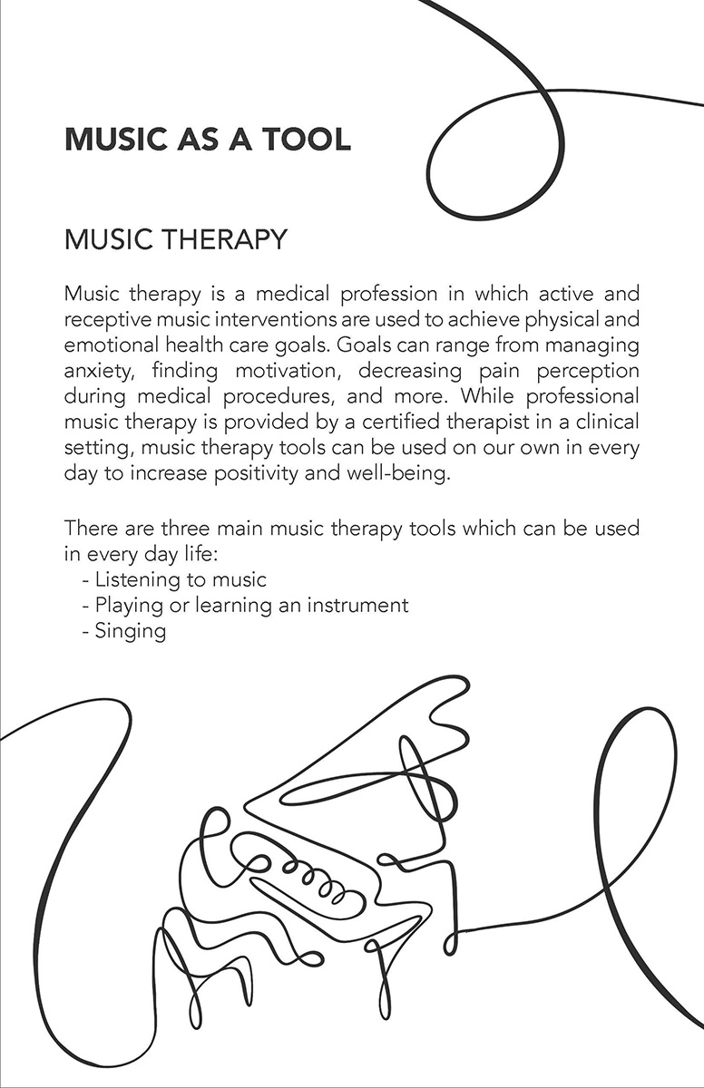
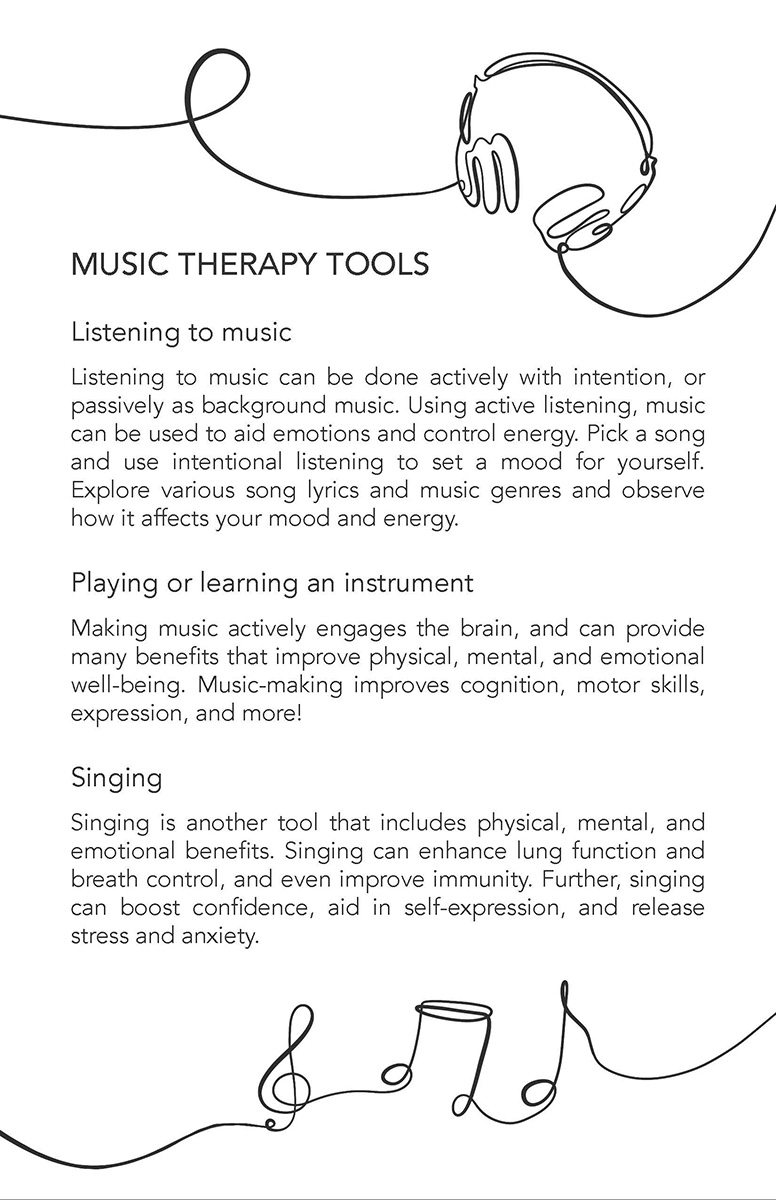
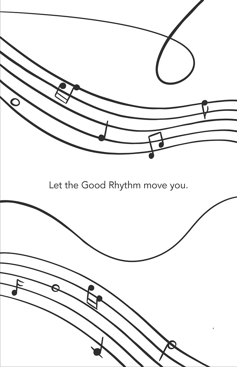
Preview of The Good Rhythm Zine pages
The Good Rhythm Zine
Where it all began
The Good Rhythm began in a typography classroom. For a project that required the creation of a zine with a topic of choice — The Good Rhythm came to life. With the TGR mission in mind, The Good Rhythm Zine combines visual and textual content in a way that is both functional and artistic to promote positivity through content and artistic expression. Implementing style elements that are inspired by the musical staff, the TGR zine has brought forward a musical platform that has evolved into this site. Outside of promoting the TGR mission, our zine also represents the versatility of music
Zine Design
How the music staff inspired the TGR style
Illustrations
The TGR zine’s illustrations are all hand drawn, utilizing a calligraphic style to represent both music’s expressive freedom, as well as the varying line weight of Roman serifed fonts that are used in sheet music. The flowing lines guide the reader through the pages, representing the journey that listening to music can take us.
Layout
The TGR zine’s layout reflects the structured science of music theory as well as drawing from visual components of the musical staff. Utilizing a black and white color scheme and a serifed title font, the zine takes inspiration from sheet music. The use of sans serif font and straight-forward layout of body text represents music’s structure and theory.
Zine Preview
Take a look at the preview below!
Preview of The Good Rhythm Zine pages